
We’ve been doing a lot of work with color palettes at Kwippe in the last few weeks. Even my kids have gotten in on the action, giving ideas about which colors look good together, and which don’t. Our app comes loaded with thousands of pre-made color palettes that it uses behind the scenes, as well as dozens for users to choose from in the front end.
I’ve come to see that some palettes that look lovely when you put them together, don’t produce very usable designs. I’ve seen 3 basic problems with most of these palettes:
1- Too few colors
2- Too many light or dark colors
3- Not enough contrast between the colors
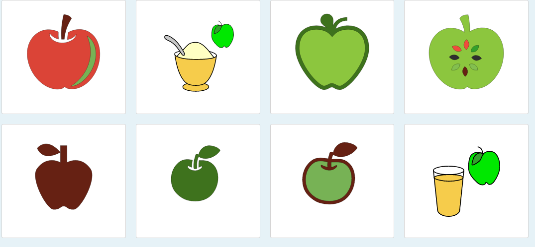
One my favorites is actually the palette for the keyword APPLE. It’s great because it contains several nice greens and reds, along with some gold colors - but no black or white. While black and white are nice when used sparingly, they can also overwhelm the other colors if overused.
The ability for pro users to choose their own palettes and use them in the future is a cool feature I’m working on now, and it should help app developers and others to create some working definitions they can reuse over and over again with new graphic sets. We’re trying to keep a keen eye on the fact that Kwippe needs to be focused on generating usable designs for folks - not just art for fun! While we do think the app is pretty fun to use… :)